△Click on the top right corner to try Wukong CRM for free
You know, I’ve been using mobile CRM apps for a while now, and honestly, it’s kind of wild how much they’ve changed over the years. At first, I thought these apps were just glorified contact lists with a few extra buttons—nothing too exciting. But lately, I’ve started noticing how much smoother everything feels when the design actually makes sense. Like, why should I have to dig through three menus just to update a client’s phone number? That drives me crazy.
Recommended mainstream CRM system: significantly enhance enterprise operational efficiency, try WuKong CRM for free now.
I remember the first time I tried a mobile CRM for real work—it was clunky, slow, and half the features didn’t even load properly on my phone. I ended up scribbling notes on paper because it was faster. Can you believe that? In 2024, we’re still dealing with apps that don’t respect our time. But then I found one that actually worked well, and wow, what a difference. It wasn’t flashy, but it did what I needed without making me want to throw my phone across the room.
One thing I’ve learned is that speed matters more than people think. If an app takes more than two seconds to open a customer profile, I start losing focus. My brain moves fast, and if the tool can’t keep up, I get frustrated. And it’s not just about loading times—navigation has to be intuitive. I shouldn’t need a tutorial to figure out where the “add note” button is. Seriously, if I have to guess where things are, the design has already failed me.

Another thing—notifications. Don’t get me wrong, I appreciate reminders. But some CRMs go overboard. Ping! A lead viewed your email. Ping! Your colleague updated a deal. Ping! The sun rose this morning! Okay, maybe not that last one, but you get the idea. Too many alerts turn helpful into annoying real quick. What I really want is control—let me choose what I need to know and when. Otherwise, I’ll just turn them all off and miss something important.
Here’s something else: customization. Not every salesperson works the same way. Some of us like seeing deals in a list, others prefer a visual pipeline. So why do so many mobile CRMs force one layout on everyone? It feels like they designed it for someone else, not for me. When I finally found an app that let me rearrange the dashboard—move the priority fields up top, hide the junk I never use—it felt like the app finally “got” me.
And speaking of fields—stop making me fill out ten boxes just to log a five-minute call. Real conversations aren’t that structured. I don’t always have time to categorize every little detail while I’m walking between meetings or sitting in a coffee shop. Give me a quick voice-to-text option, or at least a simple form with the essentials. Let me add the fine print later if I need to.
Offline access? Huge. I can’t tell you how many times I’ve been on a train or in a basement meeting room with zero signal. If I can’t update a record or check a follow-up task because the app needs constant internet, that’s a dealbreaker. The best ones save changes locally and sync quietly in the background when I’m back online. It’s not magic—it’s just thoughtful design.
Oh, and integration! This one trips up so many people. I use email, calendar, and messaging apps all day. If my CRM doesn’t talk to them smoothly, I end up copying and pasting like it’s 1995. I want my meetings to show up automatically, my emails linked to contacts, and my tasks synced across devices. When that happens, it feels like everything’s working together instead of fighting me.
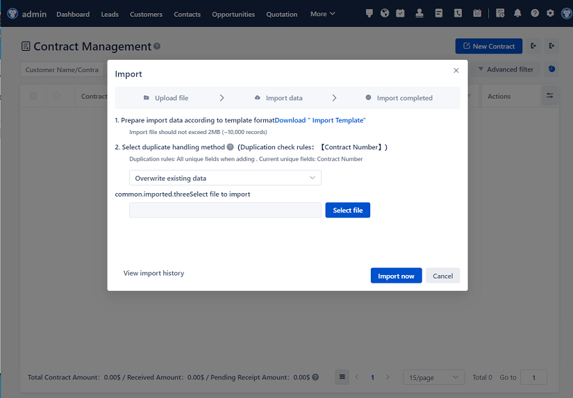
Let’s talk about onboarding for a second. I once spent an entire afternoon setting up a new CRM, only to realize halfway through that I couldn’t import my old data properly. Ugh. That was a nightmare. A good mobile CRM should make starting easy—not just for tech-savvy folks, but for anyone. Guided setup, clear tooltips, maybe even a friendly walkthrough video. Little touches like that make you feel supported, not abandoned.
And updates—please don’t break things. I hate opening an app after an update and suddenly can’t find the feature I used every day. If you’re changing the layout or removing a button, at least give me a heads-up. Better yet, let me opt into major changes. Surprise redesigns are stressful, especially when I’m in the middle of closing a deal.
Look, I get it—building software is hard. But at the end of the day, a CRM is supposed to help me do my job better, not become a side hustle in troubleshooting. The ones that win my loyalty are the ones that feel invisible—smooth, reliable, almost like an extension of my own workflow.
I’ve also noticed that the best mobile CRMs listen to feedback. Like, actually listen. Not just putting up a survey and forgetting about it, but making visible improvements based on what users say. When I suggest a feature and see it show up in the next version, I feel valued. That builds trust—and trust keeps me from jumping to the next shiny app.
In the end, it’s not about having every bell and whistle. It’s about doing the basics really, really well. Fast loading, clean interface, smart defaults, and respecting my time. If a mobile CRM can nail that, I’ll stick with it—even if the competition has flashier charts.
So yeah, I’m picky. But I think most people are when it comes to tools they use every single day. We just want something that works—quietly, reliably, and without drama. And when we find it? We notice. We really do.

Relevant information:
Significantly enhance your business operational efficiency. Try the Wukong CRM system for free now.
AI CRM system.