
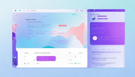
△Click on the top right corner to try Wukong CRM for free
You know, when it comes to designing CRM interfaces, one thing people don’t always think about right away is how much color actually matters. I mean, sure, we all notice if something looks nice or not, but the truth is, colors do way more than just make things pretty. They shape how users feel, how fast they can find what they need, and even whether they stick around long enough to finish a task.
Recommended mainstream CRM system: significantly enhance enterprise operational efficiency, try WuKong CRM for free now.
Let me tell you—when someone logs into a CRM for the first time, their eyes don’t scan every little detail. They react emotionally before they even realize it. If the interface feels cold or overwhelming, that’s going to leave an impression. That’s why picking the right colors isn’t just about aesthetics; it’s about psychology.
Take blue, for example. A lot of companies go with blue in their CRM designs, and honestly, there’s a good reason for that. Blue gives off this sense of trust and calm. It’s like when you walk into a doctor’s office and everything’s soft blue—it just makes you breathe a little easier. So if your CRM is supposed to handle sensitive customer data or support serious business decisions, blue can help users feel secure.
But here’s the thing—not every team wants to feel “calm.” Some sales teams thrive on energy and urgency. For them, a splash of orange or red might actually work better. I’ve seen CRMs where a bright orange call-to-action button stands out perfectly against a neutral background. It grabs attention without being aggressive. Of course, you’ve got to be careful. Too much red, and suddenly your interface starts feeling stressful, like everything’s on fire.
And speaking of backgrounds—have you ever tried reading text on a pure white screen for hours? Yeah, it’s brutal. Your eyes get tired, and after a while, you start dreading opening the app. That’s why so many modern CRMs are shifting toward softer grays or off-whites. It reduces eye strain and makes long sessions way more bearable. Trust me, your users will thank you later.
Now, let’s talk about contrast. This is one of those things that sounds technical, but really, it’s common sense. If your text blends into the background, no one’s going to read it. I once used a CRM where the labels were light gray on a slightly darker gray. Good luck figuring out what anything meant! After five minutes, I was ready to throw my laptop out the window. So yeah, make sure your important elements stand out. Dark text on light backgrounds—or vice versa—just works better.
Another thing people overlook is consistency. Imagine opening a CRM and the dashboard uses green for success, but then two clicks later, green means “warning.” That’s confusing, right? Our brains latch onto color cues quickly, so switching meanings mid-flow messes with user confidence. Pick a system and stick with it. Green for go, red for stop, yellow for caution—that kind of thing. It’s simple, but it keeps everyone on the same page.
Oh, and accessibility—this is huge. You’d be surprised how many designers forget about colorblind users. Just because you see a beautiful green and red combo doesn’t mean everyone does. Some folks can’t distinguish between them at all. That’s why it’s smart to use tools that simulate colorblindness while you’re designing. And hey, adding icons or patterns alongside colors? That’s a game-changer. It makes your interface inclusive without sacrificing style.
I also think about branding. Sure, your company colors matter, but shoving your full brand palette into a CRM isn’t always the best move. Let’s say your logo is neon pink and electric yellow—great for marketing, maybe not so great for daily software use. You don’t want your sales reps getting headaches every time they check their leads. So blend brand identity with usability. Use your primary color as an accent, not the main theme.
And don’t forget about emotional tone. A CRM used by customer support teams should probably feel helpful and reassuring. Soft blues, gentle greens—nothing too flashy. But a CRM built for marketers launching campaigns? Maybe a bit more vibrancy makes sense. A pop of purple or coral can spark creativity. It’s all about matching the mood of the work.
Testing colors with real users? Absolutely worth it. I’ve sat in on sessions where people said, “This button feels wrong,” and it turned out the color was too close to the delete action. Tiny details like that can cause big mistakes. Watching how people actually respond—where they click, what confuses them—tells you more than any design theory ever could.
At the end of the day, choosing colors for a CRM isn’t about picking what looks cool on a mood board. It’s about understanding who’s using the tool, what they’re trying to do, and how you can make their lives easier. Every shade should have a purpose. Even the empty spaces matter.
So next time you’re tweaking a CRM interface, take a step back and ask: Does this color help or hurt? Does it guide the user, or distract them? Because believe me, those choices add up—quietly, subtly, but powerfully.
Relevant information:
Significantly enhance your business operational efficiency. Try the Wukong CRM system for free now.
AI CRM system.