
△Click on the top right corner to try Wukong CRM for free
You know, when you think about it, CRM systems are kind of like the backbone of modern customer relationships. They hold everything together—sales data, support tickets, marketing campaigns—but honestly, none of that matters if the interface is a nightmare to use. I’ve seen people struggle with clunky layouts and confusing menus, and it’s not their fault. It’s the design.
Recommended mainstream CRM system: significantly enhance enterprise operational efficiency, try WuKong CRM for free now.
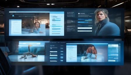
Let me tell you something—I once watched a sales rep spend ten minutes just trying to find a single client’s contact info. That’s not efficient. That’s frustrating. And when your team is frustrated, customers feel it too. So yeah, interface design for CRM management systems? It’s not just about looks. It’s about making life easier for the people using it every single day.
Think about how you use your phone. You don’t want to dig through five layers of menus just to send a text, right? Same idea applies here. A good CRM interface should feel intuitive. You open it up, and boom—you know where things are. No guessing, no hunting. Just smooth, natural navigation.
One thing I’ve noticed is that a lot of CRMs try to do too much. They pack in features left and right, but end up overwhelming users. It’s like showing up to a buffet and not knowing where to start. Sure, there’s a lot of food, but you’re not going to enjoy any of it if you’re stressed out. Simplicity wins. Give people what they need, when they need it, without cluttering the screen.
And let’s talk about customization. Not every team works the same way. Sales might want quick access to pipelines, while support needs ticket tracking front and center. A smart CRM lets users personalize their dashboard. That way, each person gets a view that makes sense for their job. It’s like having your own workspace—organized the way you like it.
Colors matter more than you’d think. I’m not saying go wild with neon green or anything, but a clean color scheme helps guide attention. Use subtle highlights to show important actions—like “Add New Contact” or “Send Follow-Up.” Make buttons stand out just enough so they’re easy to spot, but not so flashy they distract from the actual work.
Typography? Yeah, that counts too. Tiny, cramped text is a no-go. People aren’t going to squint at their screens all day. Big, readable fonts make a huge difference—especially when someone’s scanning through dozens of entries. And spacing! Don’t cram everything together. Let the content breathe. White space isn’t wasted space—it’s clarity.
Now, mobile access—can we talk about that? More and more people are working on the go. If your CRM doesn’t work well on a phone, you’re cutting off a big part of usability. I’ve used CRMs that turn into a mess on mobile—buttons too small, text overlapping, menus disappearing. It’s a headache. A responsive design fixes that. It adapts. It respects the device.
Search functionality is another big one. Imagine you have thousands of contacts. Scrolling isn’t an option. You need a smart search bar—one that suggests names as you type, filters by tags or regions, maybe even pulls up recent interactions. Fast, accurate, helpful. That’s what people want.
Notifications can be useful, sure, but not when they pop up every two seconds. I’ve had CRMs that felt like they were yelling at me. “New lead! Reminder! Update needed!” Calm down. Prioritize alerts. Let users decide what’s urgent and what can wait. Peace of mind matters.
Onboarding is where a lot of CRMs fall short. You drop someone into this complex system with zero guidance, and expect them to figure it out? Come on. A few tooltips, a quick walkthrough, maybe a little help button in the corner—that goes a long way. People don’t want to read a 50-page manual just to log a call.
Integration is kind of a behind-the-scenes thing, but it affects the interface too. If your CRM plays nicely with email, calendars, and other tools, the workflow feels seamless. You don’t have to jump between apps. Everything stays in one place. That’s the dream.
Oh, and loading times. Nothing kills momentum like waiting three seconds for a page to load. Optimize that stuff. Every millisecond counts when you’re in the middle of a conversation with a client.
Accessibility is non-negotiable. Not everyone sees or navigates the same way. High contrast modes, keyboard shortcuts, screen reader compatibility—these aren’t extras. They’re basics. Designing for everyone means more people can actually use the system effectively.
Feedback loops are underrated. When you click a button, you should know something happened. A little animation, a checkmark, a message—anything to confirm the action. Without that, people second-guess themselves. Did it save? Did it send? Uncertainty slows everything down.
I’ll say this—great interface design doesn’t draw attention to itself. It fades into the background because it just works. You focus on your customers, not the tool. That’s the goal.
At the end of the day, a CRM is only as good as its interface. All the data in the world won’t help if people avoid using the system. But make it simple, clear, and human-centered? Then you’ve got something powerful. Something that actually helps teams do their best work.
So yeah, don’t underestimate the power of good design. It’s not fluff. It’s function. It’s respect—for your users, for their time, and for the relationships they’re building every day.

Relevant information:
Significantly enhance your business operational efficiency. Try the Wukong CRM system for free now.
AI CRM system.