
△Click on the top right corner to try Wukong CRM for free
Alright, so you know when you go to a website or open an app for the first time and you’re like, “Okay, where do I sign in?” That moment? It’s kind of a big deal. Honestly, your login screen is usually the very first real interaction someone has with your product. And if it’s confusing, ugly, or just annoying, they might not even stick around long enough to see how great everything else is.
Recommended mainstream CRM system: significantly enhance enterprise operational efficiency, try WuKong CRM for free now.
I mean, think about it—how many times have you bounced from a site because the login form looked sketchy or asked for way too much info right off the bat? Yeah, me too. So designing a good login interface isn’t just about looks; it’s about trust, usability, and making people feel welcome.
Let’s start with something simple: keep it clean. Like, really clean. When someone lands on your login page, their brain should go, “Oh, cool, this is where I type my email and password.” Not, “Wait… is this a scam? Why are there five buttons? What’s that weird checkbox for?”
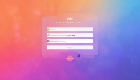
So, minimalism works wonders here. One clear heading—like “Log In” or “Welcome Back”—a couple of input fields (email and password, maybe), a “Remember Me” option if it makes sense, and a nice, obvious button that says “Sign In” or “Log In.” That’s it. Don’t overcomplicate it.
And speaking of those input fields—make them easy to use. Use proper labels. Placeholder text like “Enter your email” is helpful, but don’t rely on it alone. If someone starts typing and the placeholder disappears, they might forget what that field was for. So either keep the label visible above or use floating labels that move up when you click in.
Also, please—please—don’t make people guess whether they should use their username or email. Most people these days expect to log in with their email. Just go with that unless you have a really good reason not to.
Now, what about passwords? Ugh, passwords. We all hate them, but we still need them. So let’s make the experience less painful. First, give people the option to show their password. I can’t tell you how many times I’ve typed my password wrong just because I didn’t realize I had caps lock on. A little eye icon that lets you peek? Lifesaver.
And while we’re at it—don’t hide the password field behind some vague “Forgot your credentials?” link. Make the “Forgot Password?” option visible, but subtle. Maybe under the password field, in smaller text. People will find it when they need it.
Error messages? Super important. If someone types the wrong password, don’t just shake the screen or turn the box red without saying why. Tell them clearly: “The password you entered is incorrect. Try again.” And if the email doesn’t exist? Say that too—but be careful. You don’t want to confirm which emails are registered (security risk), so maybe say something like “We couldn’t find an account with that email.”
Accessibility matters a ton here. Make sure your form works with screen readers. Use proper HTML semantics—like <label> tags tied to inputs with for and id. Keyboard navigation should flow naturally. Tab should go from email → password → remember me → sign in → forgot password. No jumping around.
Color contrast is another thing. If your text is light gray on a white background, good luck reading it. Make sure there’s enough contrast so everyone—not just people with perfect vision—can actually see what they’re doing.
Oh, and loading states! If someone clicks “Sign In,” don’t just freeze. Show a spinner or change the button text to “Signing in…” so they know something’s happening. Nothing worse than clicking and wondering, “Did it work? Should I click again?”
Now, let’s talk about mobile. Because honestly, most people are logging in from phones these days. Your login form better look good on a tiny screen. Big tap targets—buttons and input fields should be easy to press with a thumb. Autofocus the email field so the keyboard pops up right away. And use the right keyboard type—email keyboard for email fields, regular for passwords.
Autocomplete? Yes, please. Let browsers save login info if the user wants. Don’t block autofill with weird JavaScript tricks. People rely on that. If you disable it “for security,” you’re probably misunderstanding both security and user behavior.
Speaking of security—two-factor authentication (2FA) is great, but don’t spring it on people during their first login. Guide them through setting it up after they’ve signed in successfully. Make it optional at first, then gently encourage it later. Forcing 2FA upfront can scare people off.
And hey—what about social logins? Things like “Continue with Google” or “Sign in with Apple”? They can be super convenient. But don’t make them the only option. Some people don’t want to use their social accounts, or they don’t have one set up. Offer traditional login as well.
If you do include social options, make the buttons recognizable. Use official logos, proper colors, and clear text. Don’t make users guess what “Login #3” does.
Registration? If your login page also links to sign-up, make that link obvious but not distracting. “Don’t have an account? Sign up” —simple, friendly. And if someone clicks it, take them to a clean registration form that follows the same design principles.
One thing I see too often: unnecessary fields. On a login form, you shouldn’t be asking for phone numbers, birthdates, or security questions. That’s for registration or profile setup. Login is just email + password. Keep it focused.
Also—no auto-redirects. Don’t send people to their dashboard the second they open the login page. What if they just wanted to check something real quick? Let them decide when to log in.
Speed matters too. If your login page takes forever to load, people will leave. Optimize images, minimize code, use caching. Every second counts.
And branding—yeah, it’s okay to include your logo, but don’t turn the whole page into an ad. The goal is to help people log in, not sell them something. Keep branding subtle and supportive.
What about dark mode? If your app supports it, your login screen should match. Respect system preferences. Nobody wants to be blinded by a white screen at midnight.
Language—use plain, friendly words. Not “Authenticate Your Identity” but “Welcome back! Please log in.” Tone matters. You’re talking to a human, not filling out a government form.
And test it. Seriously, watch real people try to log in. You’ll be shocked at what confuses them. Maybe they don’t see the “Forgot Password?” link. Maybe they think the social buttons are ads. Observing real behavior beats guessing every time.
Oh, and error recovery. If someone fails to log in three times, don’t lock them out immediately. Give a warning first. And if you do lock them, tell them how long—“Try again in 10 minutes”—and offer help: “Need assistance? Contact support.”
Session management matters after login too. If someone closes the app and comes back, should they stay logged in? Depends on the app. Banking apps? Probably not. A recipe app? Sure. Give users control—“Stay signed in on this device” with a checkbox.
And logout—make it easy to find when needed. Don’t bury it in menus. But also, don’t make it too prominent. You don’t want people accidentally signing out.
Finally, empathy. Design like you’re helping a friend. Imagine your mom trying to log in. Is it easy for her? Can she read the text? Find the buttons? Understand the errors?
Because at the end of the day, a good login interface isn’t about fancy animations or trendy designs. It’s about removing friction. It’s about saying, “Hey, I’ve got you. Just enter your info, and you’re in.”
It’s not glamorous work, but it’s essential. A smooth login builds trust. It tells users, “This product respects your time and intelligence.” And that? That makes them more likely to stick around.
So next time you’re tweaking that login form, step back and ask: Is this helping or hurting the person on the other side? If it’s helping—great. If not, simplify. Clarify. Test. Repeat.
You’d be surprised how much a well-designed login can improve the whole user experience. It’s the front door to your app. Make sure it’s welcoming, secure, and easy to open.
Q: Why is the login interface so important?
A: Because it’s often the first real interaction a user has with your product. A confusing or frustrating login can drive people away before they even see your app’s value.
Q: Should I use social login options?
A: Yes, they can be convenient—but always offer a traditional email/password option too. Not everyone wants to use their social accounts.
Q: How can I make my login form more accessible?
A: Use proper labels, ensure keyboard navigation works, maintain color contrast, and support screen readers with semantic HTML.
Q: Is it okay to auto-focus the email field on mobile?
A: Absolutely. It saves users a tap and gets them started faster—just make sure the keyboard doesn’t cover important parts of the screen.
Q: What’s the best way to handle password visibility?
A: Include a toggle (like an eye icon) so users can choose to show or hide their password. It reduces errors and improves usability.
Q: Should I require two-factor authentication right away?
A: It’s better to let users set it up after their first successful login. Forcing it upfront can create friction and discourage sign-ins.
Q: How do I design for forgotten passwords?
A: Make the “Forgot Password?” link visible but not dominant. The recovery process should be simple, secure, and clearly explained.
Q: Can I use placeholder text instead of labels?
A: Not recommended. Placeholder text disappears when typing. Use visible labels or floating labels to avoid confusion.
Q: What’s the ideal number of fields on a login form?
A: Two—email and password. Keep it simple. Any more than that belongs on registration or profile pages.
Q: How should error messages appear?
A: Clearly, near the relevant field, using plain language. Avoid technical jargon and guide users toward fixing the issue.

Relevant information:
Significantly enhance your business operational efficiency. Try the Wukong CRM system for free now.
AI CRM system.