△Click on the top right corner to try Wukong CRM for free
Alright, so you know when you're trying to keep track of your customers—like who called last week, what they wanted, and whether their issue got fixed—and it just feels like you're drowning in sticky notes and half-empty spreadsheets? Yeah, I’ve been there too. It’s messy, frustrating, and honestly, kind of embarrassing when someone calls back and you have no idea who they are or what they asked for. That’s exactly why a good CRM interface matters so much. It’s not just about storing data—it’s about making that data actually useful, easy to find, and simple to work with every single day.
Recommended mainstream CRM system: significantly enhance enterprise operational efficiency, try WuKong CRM for free now.
Let me tell you something: designing a good CRM interface isn’t about cramming in as many features as possible. Nope. In fact, the more cluttered it is, the less people will use it. And if your team isn’t using the CRM, then what’s the point, right? I’ve seen companies spend thousands on fancy software only to realize nobody’s updating it because it’s such a pain to navigate. So, the real goal here is to make it feel natural—like second nature—to log interactions, check customer history, and follow up without breaking a sweat.
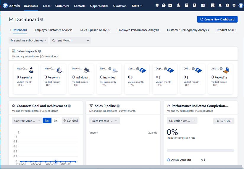
First things first: keep it simple. Like, really simple. When someone opens the CRM, they shouldn’t need a manual to figure out where to click. The dashboard should show them what they need right away—recent activities, upcoming tasks, maybe a quick glance at sales pipelines. Think about how you feel when you open your email and everything’s laid out clearly. That’s the vibe we’re going for. No guessing games. Just clean, clear, and helpful.
And speaking of clarity—labels matter. Don’t use techy jargon like “touchpoint optimization” or “synergy tracking.” Call things what they are. If it’s a customer call log, label it “Call History.” If it’s a task to follow up, say “Follow Up Needed.” Your sales rep shouldn’t have to translate corporate-speak every time they want to do their job. Keep it human, keep it plain.

Now, let’s talk about navigation. You know how annoying it is when you click into a menu and suddenly there are five submenus, and you forget which one you came from? Yeah, don’t do that. A good CRM should have a main menu that’s always visible—maybe on the left side—and it should only include the big categories: Contacts, Accounts, Opportunities, Tasks, Reports. Anything beyond that should be easy to get to without feeling lost. Breadcrumbs help too—those little links at the top that show you how you got to a page. They’re small, but man, do they save time.
Another thing—I can’t stress this enough—is search. People don’t want to click through ten pages to find John from accounting who emailed about pricing last Tuesday. They want to type “John pricing” and get the right result instantly. Make sure your search is smart. It should look across names, emails, notes, even past calls. And autocomplete? Huge win. Start typing “Micha” and boom—Michael Thompson pops up. Saves so much time.
Oh, and customization! Not everyone uses a CRM the same way. Sales might care most about deals and timelines, while support wants ticket status and response times. Let users personalize their dashboards. Let them choose which widgets they see, which columns appear in lists, even the order of tabs. When people feel like the tool works for them, they’re way more likely to actually use it.
But hey, don’t go overboard with customization either. Too many options can be just as bad as too few. Give them meaningful choices—like picking which fields show on a contact page—but don’t make them design the whole thing from scratch. That’s overwhelming. Think balance. Flexibility without chaos.
Now, let’s talk about mobile. Because guess what? People aren’t always at their desks. Sales reps are on the road, managers are at meetings, support staff might be working remotely. If your CRM doesn’t work well on a phone or tablet, you’re setting people up to fail. The mobile version shouldn’t be some stripped-down afterthought. It should let users do the important stuff—log a call, update a deal, check a customer’s history—just as easily as on desktop. Big buttons, readable text, swipe actions—little things that make mobile use smooth.
And speed! Nothing kills motivation faster than waiting three seconds every time you click something. Optimize loading times. Use lazy loading for long lists. Cache frequently used data. If the system feels slow, people will avoid it. Period.
Here’s another thing that gets overlooked: input fields. Nobody likes filling out long forms. So keep them short. Only ask for what’s necessary. Use dropdowns, checkboxes, and auto-fill whenever possible. For example, if someone starts typing a company name, pull up existing ones instead of making them type the whole thing. And validation—make it helpful, not harsh. Instead of just saying “invalid email,” highlight the field and say “Please enter a valid email address.” Small difference, big impact on user experience.
Notifications are tricky. You want people to stay informed, but not bombarded. Imagine getting pinged every time someone updates a note—even if it’s irrelevant to you. Annoying, right? So let users control what they get notified about. Maybe they only want alerts for high-priority tasks or when a deal moves to the final stage. And give them options—email, in-app pop-up, mobile push—so they can choose what works best.
Integration is another biggie. Your CRM shouldn’t live in a bubble. It should play nice with email, calendars, marketing tools, even your phone system. When a customer emails, it should automatically link to their profile. When a meeting is scheduled, it should show up in the timeline. That kind of seamless flow saves so much manual work and reduces errors.
And speaking of timelines—show the story. A customer isn’t just a name and a phone number. They’re a history of interactions. So display everything chronologically: calls, emails, meetings, purchases, support tickets. Make it scrollable, easy to skim. Add icons or color codes so you can quickly spot a recent call versus an old invoice. Visual cues help the brain process info faster.
Data entry should be as effortless as possible. Think voice-to-text for call summaries, or one-click logging after a meeting ends. The easier it is to record something, the more likely it’ll actually get recorded. And accuracy improves too—because people aren’t rushing to write notes later from memory.
Consistency in design is key. If the “Save” button is green and on the bottom right in one place, don’t make it blue and on the top left somewhere else. Same goes for fonts, spacing, button styles. When things look and behave the same way throughout the app, people learn faster and make fewer mistakes.
Accessibility matters too. Not everyone sees or navigates the same way. Use proper contrast so text is readable. Support keyboard shortcuts for power users. Make sure screen readers can interpret the content. Designing for accessibility isn’t just ethical—it makes the product better for everyone.
Feedback loops are important. When someone clicks “Save,” they should see a confirmation—maybe a little green checkmark or a message that says “Saved!” Without feedback, people wonder if it worked and end up clicking again, causing duplicates. Same with errors—clear, friendly messages help users fix issues fast.
Don’t forget about onboarding. Even the best CRM will flop if people don’t know how to use it. Build in guided tours, tooltips, and quick tips for new users. Maybe even short video walkthroughs for common tasks. Make the learning curve gentle, not steep.
And finally—listen to your users. Run usability tests. Ask real people to try completing everyday tasks and watch where they struggle. Collect feedback regularly. The people using the CRM every day will tell you exactly what’s working and what’s not. Don’t assume you know better. Sometimes the simplest suggestion—like moving a button—can make a huge difference.

So yeah, designing a good CRM interface isn’t magic. It’s about empathy. It’s about understanding how real people work, what slows them down, and what helps them move faster. It’s about removing friction, not adding features for the sake of it. A great CRM feels invisible—like it’s just helping you do your job, not getting in the way.
When it’s done right, your team actually enjoys using it. They remember customer details, respond faster, close more deals, and provide better service. That’s the real win—not just a pretty interface, but better relationships and results.
Q: Why is simplicity so important in a CRM interface?
A: Because if it’s complicated, people won’t use it consistently. Simplicity means less training, fewer mistakes, and faster adoption across teams.
Q: Should every user see the same dashboard?
A: Not necessarily. Different roles need different information. Letting users customize their view increases engagement and efficiency.
Q: How can a CRM help remote or mobile workers?
A: By offering a fully functional mobile app with offline access, quick data entry, and sync capabilities so they can stay updated anywhere.
Q: What’s the biggest mistake companies make with CRM design?
A: Overloading it with features no one uses. A cluttered interface confuses users and hides the tools they actually need.
Q: How often should a CRM interface be updated based on user feedback?
A: Regularly—but thoughtfully. Small, frequent improvements based on real usage data tend to work better than rare, massive overhauls.
Q: Can a CRM be too customizable?
A: Yes. Too many options can overwhelm users. Offer smart defaults and let people tweak only what matters most to their workflow.
Q: Is integration with other tools really that important?
A: Absolutely. A CRM that connects with email, calendar, and phone systems saves time and reduces data silos.
Q: What’s one small change that can greatly improve CRM usability?
A: Better search. Fast, accurate search across all customer data makes finding information effortless and encourages regular use.

Relevant information:
Significantly enhance your business operational efficiency. Try the Wukong CRM system for free now.
AI CRM system.