
△Click on the top right corner to try Wukong CRM for free
So, you know when you open up a CRM for the first time and you’re just kind of… lost? Like, where do I even start? That’s exactly why the homepage matters so much. It’s not just the first thing people see—it’s basically the front door to your entire system. If it’s confusing or overwhelming, users might never really get into the groove of using it properly.
Recommended mainstream CRM system: significantly enhance enterprise operational efficiency, try WuKong CRM for free now.
I’ve seen so many CRMs that are packed with features but totally fail on the homepage. They throw everything at you—charts, notifications, recent activities, tasks, messages—all crammed into one screen. And honestly? It’s too much. People don’t want to feel like they’re staring at a control panel from a spaceship. They want something simple, clear, and helpful.
When I think about designing a good CRM homepage, I always start with this question: What does the user actually need right when they log in? Not what we think they should care about, but what would genuinely help them get started with their day?
For most salespeople, that probably means seeing their upcoming tasks, maybe a quick glance at their pipeline, and any urgent alerts—like a deal that’s about to close or a customer who hasn’t been followed up with. For managers, it might be team performance, key metrics, or pending approvals. So the homepage shouldn’t be one-size-fits-all. It should adapt.
That’s why personalization is such a big deal. I mean, come on—if Sarah from sales logs in and sees John from marketing’s dashboard, that’s just weird. The system should know who’s logging in and show them what’s relevant. Maybe let users customize a bit too, like choosing which widgets they want to see or rearranging them. People love feeling in control.
Another thing I keep coming back to is clarity. Use plain language. Don’t say “Lead Conversion Velocity” when you can just say “How many leads turned into customers this week.” Big numbers, easy-to-read charts, color coding—those all help people grasp things quickly. Nobody wants to squint at tiny text or decode complicated graphs first thing in the morning.
And speaking of visuals—keep them clean. White space isn’t wasted space; it actually helps people focus. If every inch of the screen is filled, it feels chaotic. But if you give elements room to breathe, it feels calmer, more organized. Plus, it makes the important stuff stand out more.
Navigation is another thing people mess up. I’ve used CRMs where I couldn’t find the contacts page for ten minutes because the menu was buried under three layers of dropdowns. That’s frustrating. The main navigation should be obvious, consistent, and always accessible. Put it at the top or on the side—somewhere predictable. And label things clearly. “CRM” is fine as a title, but “Customers,” “Deals,” “Tasks,” “Reports”—those make sense to real humans.
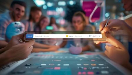
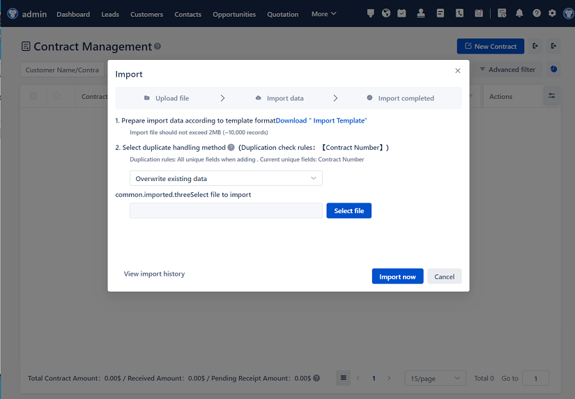
Oh, and search! Can we talk about how important search is? I don’t want to click through five menus to find one client. A big, visible search bar at the top lets me jump straight to what I need. Bonus points if it suggests names or companies as I type. That little autocomplete trick saves so much time.
Now, let’s talk about actions. The homepage shouldn’t just show information—it should help people do things. Like, if I see a task reminder, I should be able to mark it done right there without opening another page. If there’s a deal stuck in negotiation, maybe there’s a button to send a follow-up email directly from the homepage. Reduce the number of clicks. Every extra step is friction.
I also think about mobile a lot. A ton of people check their CRM on their phones during commutes or between meetings. So the homepage has to work well on smaller screens. That means stacking elements vertically, making buttons big enough to tap with a thumb, and hiding less important stuff behind menus if needed. Responsive design isn’t optional anymore—it’s expected.
Speed matters too. If the homepage takes forever to load, people will get annoyed and might just stop using it. Optimize images, minimize scripts, cache data—do whatever it takes to make it snappy. Users won’t wait around for a slow system, especially when they’re in a hurry.
One thing I’ve noticed in good CRM designs is that they highlight progress. Like, showing a progress bar for a sales goal, or celebrating when someone closes a big deal. It’s a small touch, but it makes the experience feel more human. People like feeling accomplished, and a little visual reward goes a long way.
Notifications are tricky, though. You want to keep users informed, but not bombarded. I hate it when I log in and there are 47 unread notifications—half of which are irrelevant. So prioritize them. Show the urgent ones first—like a missed deadline or an angry customer comment. Less important stuff can wait or go into a summary section.
Also, consider timing. Some CRMs send push notifications for every little thing. That gets annoying fast. Let users choose what they want to be alerted about. Respect their attention.
Onboarding is part of the homepage experience too. If someone’s new, the homepage should guide them. Maybe there’s a welcome message, a quick tour, or a checklist of setup steps. Don’t assume they know how everything works. A friendly “Get started” button can make a huge difference.
And updates—how do you tell users about new features without being annoying? I like subtle banners or tooltips that appear once and then disappear. Or better yet, tie it to behavior. If someone uses the tasks feature a lot, maybe gently suggest trying the calendar view next time.
Accessibility is non-negotiable. Make sure the homepage works for people with visual impairments, motor difficulties, or cognitive challenges. Use proper contrast, alt text for images, keyboard navigation, and screen reader compatibility. Designing for everyone isn’t just ethical—it’s smart business.
Data accuracy is another silent hero. No matter how pretty the homepage is, if the numbers are wrong, nobody will trust it. Sync data in real-time if possible, or at least update frequently. And if there’s a delay, say so—like “Updated 2 minutes ago.” Transparency builds trust.
I also think about context. What time of day is it? If it’s Monday morning, maybe highlight weekly goals. If it’s Friday afternoon, show a summary of the week’s wins. Or if someone hasn’t logged in for a few days, greet them with a “Welcome back!” and catch them up on what they missed.
Integrations play a role too. If your CRM pulls data from email, calendar, or social media, show those connections on the homepage. Like, “You have 3 unread emails from clients” or “Meeting with Acme Corp in 30 minutes.” That kind of contextual awareness makes the system feel alive.
But don’t go overboard. Just because you can connect to ten different apps doesn’t mean you should display all that info on the homepage. Stay focused on what helps the user move forward.
Feedback loops are important. Let users rate the homepage, suggest changes, or report bugs easily. Maybe add a little “Was this helpful?” button under key sections. Real input from real users is worth its weight in gold.
And finally—test it. A lot. Watch real people use the homepage. See where they hesitate, what they ignore, what they love. Then tweak, improve, and test again. Design isn’t a one-and-done thing. It’s ongoing.

So yeah, designing a CRM homepage sounds simple, but it’s actually super complex because it has to balance so many things: simplicity and power, information and action, personalization and consistency. But when it’s done right? It feels like the system is working for you, not against you.
It becomes a place people want to come back to—not because they have to, but because it helps them do their job better. And honestly, isn’t that what great software should do?
Q: Why is the CRM homepage so important?
A: Because it’s the first thing users see—it sets the tone for their entire experience. If it’s cluttered or confusing, they might never fully adopt the system.
Q: Should every user see the same homepage?
A: Not really. Sales reps, managers, and support staff have different needs. Personalizing the view based on role makes the CRM more useful.
Q: How can I make the homepage less overwhelming?
A: Focus on the essentials. Show only what’s immediately relevant, use clear labels, and give users the option to customize or hide widgets.
Q: Is it okay to include lots of charts and graphs?
A: Only if they’re simple and meaningful. Too many visuals can confuse more than help. Prioritize readability and relevance.
Q: What’s the best way to handle notifications?
A: Keep them prioritized and minimal. Highlight urgent items, summarize the rest, and let users control what they’re notified about.
Q: How often should the homepage data update?
A: As close to real-time as possible. If updates are delayed, clearly indicate when the data was last refreshed.
Q: Can users customize their homepage?
A: Ideally, yes. Letting users move, resize, or remove widgets gives them a sense of ownership and improves usability.
Q: Should the homepage work on mobile devices?
A: Absolutely. Many users access CRM systems on phones or tablets, so the design must be responsive and touch-friendly.

Q: What’s a common mistake in CRM homepage design?
A: Trying to show everything at once. Overloading the screen with data leads to confusion and decision fatigue.
Q: How can I help new users get started?
A: Include onboarding elements like welcome messages, guided tours, or setup checklists right on the homepage.
Q: Is search functionality necessary on the homepage?
A: Yes. A prominent search bar helps users quickly find contacts, deals, or tasks without navigating through menus.
Q: Should the homepage include calls to action?
A: Definitely. Buttons like “Add Contact,” “Log Call,” or “Create Deal” help users take immediate action without leaving the page.
Q: How do I balance aesthetics and functionality?
A: Prioritize function, but don’t ignore design. Clean layouts, readable fonts, and smart use of color enhance both look and usability.
Q: What role do integrations play on the homepage?
A: They add context—like showing upcoming calendar events or recent emails—but only display integration data that’s truly helpful.
Q: How can I measure if the homepage is effective?
A: Track engagement—how long users stay, which widgets they interact with, and whether they complete key tasks quickly.
Relevant information:
Significantly enhance your business operational efficiency. Try the Wukong CRM system for free now.
AI CRM system.