
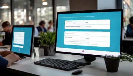
△Click on the top right corner to try Wukong CRM for free
You know, when I first started working on CRM systems, I didn’t really think much about the interface design. I mean, I figured as long as it worked, that was good enough, right? But then I actually watched real users—sales reps, customer service agents, even managers—struggling with clunky layouts, confusing navigation, and buttons that seemed to disappear into the background. That’s when it hit me: a CRM isn’t just about storing data; it’s about how people interact with that data every single day.
So, I started digging into what makes a CRM interface actually usable. And let me tell you, it’s not just about making things look pretty. Sure, aesthetics matter—nobody wants to stare at a gray, lifeless screen all day—but it’s way deeper than that. It’s about clarity, consistency, and reducing friction. Think about it: if a salesperson has to click through five menus just to update a lead status, they’re going to get frustrated. And frustration leads to errors, skipped entries, or worse—people avoiding the system altogether.
Free use of CRM system: Free CRM
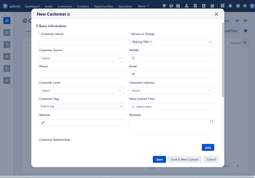
One of the first things I realized is that consistency is everything. I mean, if the “Save” button is on the top right in one form and the bottom left in another, people get confused. It’s like muscle memory—if you expect something to be in a certain place, and it’s not, it throws you off. So, we started enforcing a design standard across all CRM modules: primary actions go at the top right, secondary actions on the bottom, and navigation stays on the left. Simple, right? But you’d be surprised how many systems ignore this.
And speaking of navigation, have you ever used a CRM where you had no idea where you were? Like, you click around and suddenly you’re in a different section with no breadcrumbs or clear labels? That’s a nightmare. So we made sure every screen has a clear header, a breadcrumb trail, and a consistent sidebar menu. That way, users always know where they are and how to get back. It sounds basic, but trust me, it makes a huge difference.
Another thing we focused on was data entry. Let’s be honest—nobody likes filling out forms. They’re boring, time-consuming, and if they’re not designed well, they’re error-prone. So we started using smart defaults. For example, when creating a new contact, the system automatically fills in the country based on the user’s location. We also added inline validation—so if someone enters an invalid email, they see the error right there, not after they hit “Save” and get a red popup. That kind of instant feedback keeps people from feeling like they’re being punished for typing fast.
Oh, and dropdowns—don’t even get me started. Some CRMs have dropdowns with 50 options, and you have to scroll forever. So we implemented searchable dropdowns. Now, if you’re picking an account from a list of hundreds, just start typing the name, and it filters instantly. Game changer. Same thing with date pickers—we use a calendar widget that pops up, but also allows manual typing for power users who just want to type “03/15/2024” and move on.
Now, let’s talk about dashboards. This is where a lot of CRMs fall flat. They throw in every chart and number imaginable, and it just becomes visual noise. So we took a step back and asked: what do users actually need to see at a glance? For a sales manager, it might be pipeline value, conversion rates, and open tasks. For support, it’s ticket volume, response times, and resolution rates. So we made dashboards customizable. Users can add, remove, and resize widgets based on their role. And we use clear, color-coded visuals—green for good, red for urgent—so you can scan the screen in seconds.
One thing I’ve learned is that mobile matters. A lot of salespeople are on the road, and they need to update deals or check customer info from their phones. But so many CRMs are built for desktops and then just shrunk down for mobile. That doesn’t work. So we redesigned key workflows for mobile: bigger tap targets, simplified forms, and swipe actions. For example, in the mobile task list, you can swipe left to mark a task as complete—no need to open the full form. It’s small, but it saves time.
Accessibility is another big one. I used to think it was just about compliance, but it’s really about inclusion. We added keyboard navigation, screen reader support, and high-contrast mode. We also made sure all icons have text labels—because not everyone knows what a little gear or envelope means. And we tested with real users who have visual or motor impairments. Their feedback was eye-opening. For example, we changed our color scheme because red and green indicators weren’t distinguishable for colorblind users. Now we use shapes and patterns too.
Performance is part of the experience, too. If a page takes five seconds to load, people lose focus. So we optimized data loading—we show a skeleton screen while content loads, so users know something’s happening. We also lazy-load heavy components, like activity timelines, so the main info appears instantly. And we cache frequently accessed data, so returning to a customer profile feels snappy.
Let me tell you about error handling. Early on, our system would just say “Error: 500.” Super helpful, right? Not. So we started writing user-friendly messages. Instead of “Database connection failed,” we say “We’re having trouble saving your changes. Please check your internet connection and try again.” And we give options—like “Retry” or “Save offline.” It’s about empathy. The system shouldn’t blame the user when something breaks.
One of the coolest things we added was contextual help. Instead of a giant help manual, we put little question marks next to complex fields. Click one, and a short explanation pops up. For example, next to “Lead Score,” it explains how the score is calculated. We also added tooltips and guided tours for new users. First time in the reporting module? Here’s a quick walkthrough. It reduces the learning curve without overwhelming anyone.
Customization is huge. Different teams use CRM differently. Sales might want a Kanban view for deals, while marketing prefers a list with filters. So we built in multiple view options. And users can save their filter presets—“My Hot Leads,” “Overdue Tasks,” etc. It gives people a sense of ownership. They’re not stuck with a one-size-fits-all system.
We also paid attention to micro-interactions. When you save a record, a little green check appears. When you delete something, there’s a confirmation dialog with an undo option. These tiny details make the system feel responsive and safe. It’s like the system is talking back to you, saying, “Got it,” or “Are you sure?” That builds trust.
Security and permissions are baked into the design too. If a user doesn’t have access to edit a field, it’s grayed out—not just hidden. That way, they know the field exists but they can’t change it. And when permissions change, the interface updates instantly. No confusing errors later.
Integration with other tools is another key point. People don’t live in the CRM all day. They use email, calendars, Slack, etc. So we built seamless integrations. For example, when you receive an email from a customer, you can click a button to log it to their profile—no copy-pasting. And calendar events sync automatically. It reduces context switching, which is a major productivity killer.
Testing, testing, testing. We didn’t just design these interfaces in a vacuum. We ran usability tests with real users—watched them try to complete tasks, listened to their frustrations, and iterated. One user kept missing the “Submit” button because it blended in. So we made it brighter. Another didn’t understand what “Touchpoint” meant—so we renamed it to “Customer Interaction.” Small changes, big impact.

And we didn’t stop after launch. We collect feedback through in-app surveys and usage analytics. If we see that people are abandoning a form halfway, we investigate. Maybe it’s too long, or a required field is unclear. Data helps us make informed decisions, not guesses.
One thing I’ve come to believe is that good CRM design isn’t about adding more features—it’s about removing friction. Every click, every second of waiting, every confusing label—it adds up. And over time, that friction wears people down. But when the interface feels intuitive, when it gets out of the way, that’s when the CRM becomes a tool people actually want to use.
So, if you’re designing or choosing a CRM, don’t just look at the feature list. Watch how people interact with it. Can they find what they need in seconds? Can they complete tasks without thinking too hard? Does it feel helpful, not frustrating? Those are the real signs of good design.
At the end of the day, a CRM is only as good as the people using it. And people deserve interfaces that respect their time, their intelligence, and their goals. When you get that right, the data flows, the insights emerge, and the business grows—not because of fancy algorithms, but because real humans can actually use the system.

Q&A Section
Q: Why are design standards important for CRM interfaces?
A: Because they create a consistent, predictable experience. When buttons, menus, and workflows behave the same way across the system, users learn faster, make fewer mistakes, and feel more confident.
Q: How do you balance customization with consistency?
A: We allow users to customize views and dashboards, but we keep core navigation, terminology, and interaction patterns standardized. That way, personalization doesn’t break usability.
Q: What’s the biggest mistake companies make with CRM design?
A: Assuming that more features equal better software. Often, cluttered interfaces with too many options overwhelm users. Simplicity and focus win.
Q: How can you test if a CRM interface is truly user-friendly?
A: Watch real users complete common tasks. If they hesitate, ask questions, or make errors, those are red flags. Usability testing reveals what surveys can’t.
Q: Should mobile design be an afterthought?
A: Absolutely not. With so many users on the go, mobile needs to be considered from day one. It’s not about shrinking the desktop version—it’s about rethinking workflows for smaller screens and touch input.
Q: How do you handle users with different roles and needs?
A: We use role-based dashboards and views. A sales rep sees deal stages and tasks, while a support agent sees tickets and response metrics. Personalization helps, but it’s built on a consistent foundation.
Q: Is accessibility really that important in a business tool?
A: Yes. Beyond legal compliance, it’s about inclusivity. Everyone should be able to use the system effectively, regardless of ability. Plus, accessible design often improves the experience for all users.
Related links:
Free trial of CRM
Understand CRM software
△Click on the top right corner to try Wukong CRM for free